UPDATE, 10-02-2015: After a hint from a user on Twitter, I now know that it is possible to open a PDF document in several windows, one for text, one for legends and one for figures. Figures and legends occupy one virtual desktop and the text another. In this way, I can actually review on-screen, but it is one heck of a work-around and by no means convenient.
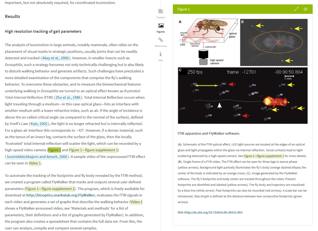
I cannot take it any more. This has been bugging me for more than ten years, but now I’ve finally had it. From today on, I will refuse to review any manuscripts that come in a format where I cannot easily have figures, legends and text side by side on my screen (or at least inline), like, e.g., in eLife’s Lens:
 The standard way of reviewing articles is to receive a PDF with all the text together first, then all the legends together below that and at the very end all the figures, one on each PDF page. This makes it virtually impossible to check the statements the authors make about their data, as one has to scroll the screen back and forth between text, legend and figure, just to find out what is displayed on the figure. Obviously, it takes ages to find the correct legend and it’s virtually impossible to find the spot where one left off to go looking for figure and legend. This needs to stop. It will stop for me. I can’t waste my time any more with such nonsense!
If you are an editor or publisher and would like me to review for your journal, make it easy and fun for me to do it and not a chore. Either develop a system like Lens, or license Lens, or ask your authors to not separate text, legends and text in their submissions, whatever! I don’t care, just stop torturing your reviewers.
Personally, I already submit my articles with figures and legends together, irrespective of what the publishers want me to do. From now on, I will not only refuse to review a manuscript where I cannot see figures, legends and text side-by-side (or inline) on my screen, I will also ignore publisher rules to separate the three in my own submissions – I don’t want the reviewers of my manuscripts to suffer more than they already have to, reviewing my work.


You realize you can make two copies of the PDF, right? That is what I do.
Yeah, great, I love having multiple copies of every ms I review flying around somewhere. 🙂
I’d rather have the publishers show a little respect for the people who work for them for free, actually. Why should I be inconvenienced when I donate my time to them pro bono?
Agreed that the convention is silly, but easy enough to just open multiple copies of pdf, no?
Of course I can open three different windows, one for text, one for figures and one for legends – which already excludes doing reviews while traveling, as my laptop’s screen is really very inconvenient for that.
Moreover, why should I invest in the latest and greatest in screens and other hardware, instead of publishers investing some of their billions in profit for the labor they get from us for free?
Hard to believe this made it onto RW pages as an article or point of discussion. There are options. 1) Split screen; 2) Dual screens (highly effective, convenient and increases review productivity); 3) Save/Open two versions of the paper and use option 1) or 2). Torturing reviewers? Hardly – come on now, there are more challenging things in academic life to be considered torturous.
Why should I jump through hoops when I work for publishers pro bono? Why should I pay yet more tax-funds for a second screen just so publishers get to reap in 40+% in profits from our work? We pay, on average, US$5000 for each article, of which more than 2000 are publisher profits and another 3k+ go towards making the article impossible to read (i.e., paywalls). And those 5k aren’t even counting the billions worth of free reviewer labor. And then it is too much to ask to just click on a manuscript and be able to review it? You’ve got to be kidding me!